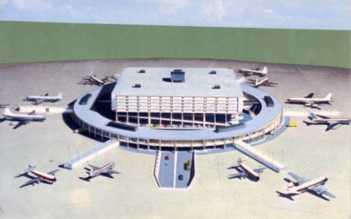
Completed in 1964, the new Toronto International Airport was the city’s sleek, silvery entry into the Jet Age. The postcard above, a rendering by architects John B. Parkin Associates, depicts the only completed Aeroquay terminal building of the projected four.
The innovative planning of the Aeroquay drew immediate international attention. A glass-walled perimeter ring housing passenger concourses and departure lounges encircled a central core with a 2400-car parking garage, ticket counters and passenger processing facilities. Compared to the typically long, linear terminals of the period, the Aeroquay’s novel and compact ring-and-core configuration minimized distances between automobiles and airplanes and improved other key efficiencies.
Also notable was the Toronto airport’s visual integration. Parkin was responsible for the overall master plan and all structures, and so the control tower, power plant, administration building, postal station and automobile service station were cohesively designed in a consistent palette of concrete, glass, and stainless steel. Advertising signage and other commercial distractions were kept to an absolute minimum.
As at other Canadian airports commissioned during the late 1950s and 60s, the federal Department of Transportation championed the expression of a national cultural identity by showcasing the work of Canadian designers and artists. Toronto’s furnishings were designed by Robin Bush, Stefan Siwinski and Court Noxon, while typography and signage were by Allan Fleming and John Gallop. Artists Harold Town, Kazuo Nakamura, Jean-Paul Riopelle, Graham Coughtry, Jean McEwan and others contributed murals and sculptures. Even the airport’s utilities were celebrated: electrical and mechanical equipment was painted warm shades of orange and yellow or cool blues and greens, depending on function, and displayed inside a Miesian glass box between the entrance and exit parkways.
Today, little of the above exists. The postal station and automotive service station were removed in the early 1970s and all remaining buildings, including the Aeroquay itself, were demolished between 1997 and 2004 as part of the airport’s long-term redevelopment. Artworks have fared better; several have been refurbished and reinstalled in and around the new Terminal 1. While the Aeroquay concept was a breakthrough in the early 1960s, it was soon made obsolete by the exponential growth of passenger volumes and by the considerable increase in the size of commercial aircraft. Designed in the days of limited air travel and 100- to 200-seat transcontinental planes, the Aeroquay could not efficiently accommodate wide-body giants such as the 500-passenger Boeing 747. And expansion by building additional Aeroquays soon proved financially and operationally impractical.
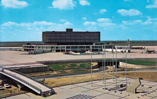
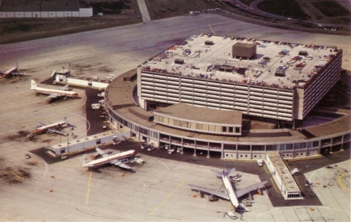
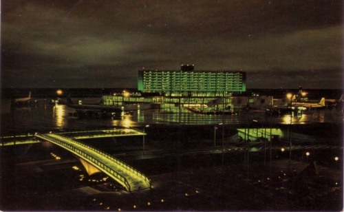
Below is a postcard published shortly after the airport’s completion; note the absence of jet bridges, the open observation deck below the stylish Aeroquay restaurant and the clusters of plane-watchers atop the parking garage. On the tarmac are a Vickers Viscount and a pair of Vickers Vanguard propliners in Trans-Canada Airlines livery (renamed Air Canada in 1965). In the foreground, representing the next generation of air travel, is a BOAC Boeing 707 jetliner. The image at bottom, taken from the roof of the administration building, captures the glamour of airport lights in the rainy night and planes waiting to whisk passengers to destinations unknown.


Hi Robert –
Just flew through T1 this month and once again made a pilgrimage to Michael Snow’s “Goddess of Space – Rockette.” Your post brought back tons of memories working in the Aeroquay’s admin building decades agp, so I wrote my own post on the subject and borrowed a few of your pics; hope you don’t mind. Cheers, Michael
Hi Michael – glad you liked the post – sure, you’re welcome to use the Pearson images. (They’re someone else’s, anyway…) Great post on Mirabel – the vintage images and PR puffery certainly seem ironic today.
Robert
Sorry, here’s the link: designKULTUR. Michael
Thanks for the link – I enjoyed the post. Great additional imagery, and I particularly liked the Canada 1964-67 collage near the top.
Robert